Effective Data Storytelling using Beautiful Data Visualizations
Data visualization is a powerful tool to communicate complex data in a simple and attractive way. Data visualization can help you reveal patterns, trends, outliers, and relationships in your data, as well as tell a compelling story or persuade your audience. However, designing effective and engaging data visualizations is not an easy task. It requires a combination of data analysis, design skills, and storytelling techniques. Here are some tips to help you create better data visualizations:
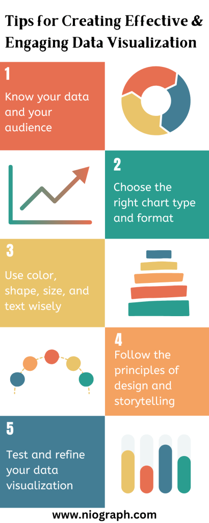
Know your data and your audience –
Before you start designing your data visualization, you need to understand your data and your audience. What is the main message or question you want to answer with your data? What are the key insights or takeaways you want to convey? Who are you creating the data visualization for and what do they need or expect from it? How will they use or interact with your data visualization? These questions will help you define the purpose, scope, and format of your data visualization.
Choose the right chart type and format-
Depending on your data and purpose, different chart types and formats can have different impacts and implications. For example, bar charts are good for comparing categories, line charts are good for showing trends, pie charts are good for showing proportions, and maps are good for showing spatial relationships. You should also consider how many variables, dimensions, or categories you want to show and how they relate to each other. You can use simple charts for simple data or combine multiple charts for complex data. You should also choose the right format for your data visualization, such as static, interactive, animated, or dashboard.
Use color, shape, size, and text wisely –
These are the visual elements that can make or break your data visualization. You should use them to highlight the most important or interesting aspects of your data, create contrast and hierarchy, and guide the eye of the viewer. You should also avoid using too many colors, shapes, sizes, or texts that can clutter or distract from your data. You should also choose colors that are appropriate for your data type, audience, and context. For example, you can use warm colors for positive values and cool colors for negative values, or use colorblind-friendly palettes for accessibility.
Follow the principles of design and storytelling-
Design is not just about aesthetics, but also about functionality and usability. You should follow the basic principles of design such as balance, alignment, proximity, repetition, contrast, and white space to create a harmonious and coherent data visualization. You should also follow the principles of storytelling such as hook, context, conflict, resolution, and call to action to create a clear and meaningful data visualization. You should also use titles, captions, annotations, legends, and sources to provide context and credibility to your data visualization.
Test and refine your data visualization –
The last step of designing effective and engaging data visualizations is to test and refine them. You should test your data visualization with your intended audience or users and get feedback on how they perceive and understand it. You should also test your data visualization for accuracy, clarity, and consistency. You should then use the feedback and testing results to improve your data visualization until it meets your goals and expectations.
In today’s data-driven world, the ability to effectively communicate complex information is more important than ever. Data visualization, the art of representing data visually, has emerged as a powerful tool to transform raw numbers into captivating visual narratives. Beyond mere graphs and charts, the design of data visualizations plays a critical role in capturing attention, conveying insights, and inspiring action. In this blog post, we will explore the principles and best practices of designing beautiful data visualizations that transcend mere information and elevate it into the realm of art. Join Niograph on this journey as we uncover the secrets to creating visually stunning and impactful data visualizations that engage, inform, and inspire.